
Biyyam:
A Timeless Brand Identity for Premium Basmati Rice
Biyyam, a brand specializing in high-quality Basmati rice grown in Dehradun and distributed worldwide, has embraced a strategic, visually compelling logo that exudes trust, authenticity, and excellence.
1. Visual Hierarchy & Monogram Strength
The logo follows a structured visual hierarchy, ensuring clarity and immediate brand recognition.
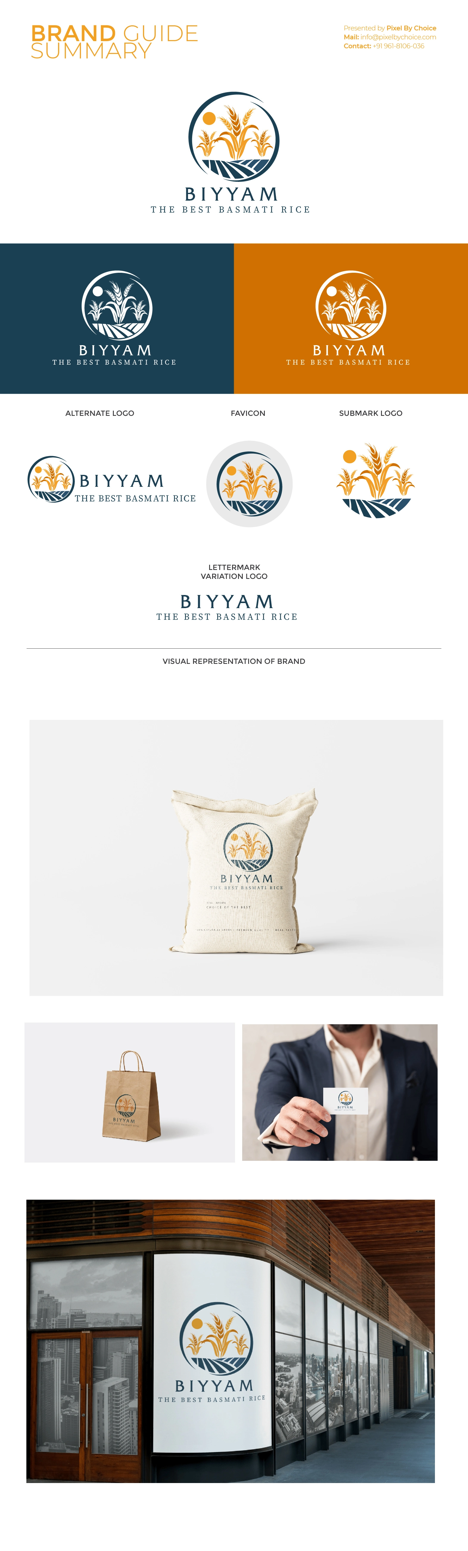
Central Monogram (Primary Focus):The circular emblem encapsulates golden
rice plants on an agricultural field under the sun, creating a symbolic and elegant
representation of nature, purity, and authenticity. The crescent-shaped stroke on the
outer edge reinforces a sense of continuity and premium quality.
Typography (Secondary Focus):The name "BIYYAM" is in a classic
serif font, delivering a blend of tradition and sophistication. The tagline, "The Best
Basmati Rice," further enhances the credibility of the brand.
Balanced Composition:The combination of a strong monogram and
refined typography ensures that the brand mark is visually appealing and instantly
recognizable.
2. Readability & Scalability
- High Readability: The carefully chosen serif font ensures that BIYYAM
remains clear and
legible across different print and digital applications.
- Scalability: The monogram and typography are well-proportioned,
ensuring the logo
retains its integrity at various sizes, from small rice packaging to large-scale
billboards and export documents.
3. Color Psychology & Branding Impact
The color palette plays a pivotal role in shaping the brand’s perception.
Gold/Amber (Rice & Sun): Symbolizes premium quality, natural
purity, and trustworthiness, reinforcing the heritage of Dehradun’s finest Basmati rice.
Deep Blue (Field & Text): Represents stability, professionalism,
and reliability, fostering customer confidence in Biyyam’s global presence.
Dark Accents (Outlines & Shadows): Add depth and refinement,
ensuring the logo maintains a luxurious and high-end feel across applications.
4. Longevity & Timeless Appeal
The elegant serif typography, organic monogram, and minimal yet meaningful design elements contribute to a timeless aesthetic.
-The classic yet contemporary execution ensures that the brand remains relevant and
doesn’t require frequent redesigns.
-The balance between modern precision and traditional farming heritage enhances its
longevity, making it reliable for years to come.
5. Logo Usage & Versatility
Perfect for Packaging Design:
- Easily adaptable to various packaging formats (pouches, boxes, and jars).
- The monogram can be used independently as a premium quality seal or stamp on
high-end packaging.
- Works well for both local and export markets, reinforcing the brand’s commitment
to quality.
Effective Across Digital & Print:
- Suitable for social media branding, websites, and mobile applications.
- Retains its elegance in monochrome or foil-stamped versions, making it ideal for
premium product labeling.
6. Consumer Trust & Market Positioning
- Easily adaptable to various packaging formats (pouches, boxes, and jars).
- The nature-inspired visuals and gold-tone hues convey freshness and authenticity,
making consumers feel confident in the product’s quality.
- The refined typography and structured layout suggest premium craftsmanship,
positioning BIYYAM as a high-end Basmati rice brand in the international market.
Final Verdict: A Powerful & Market-Ready Identity
The Biyyam logo successfully captures the essence of premium Basmati rice while balancing heritage, trust, and global appeal. It is visually appealing, highly scalable, and strategically designed to enhance brand recognition.
For brands in the premium agricultural and FMCG sector, this logo serves as an exemplary case of how a well-executed identity builds consumer confidence, enhances brand recall, and ensures long-term usability in global markets.
Clients


